
Grow
•
February 4, 2026
Here are the five most common design mistakes costing small businesses valuable opportunities. Website design mistakes hurting conversions? Your website should work as your hardest‑working salesperson — nurturing leads, showcasing
Joe Abellard

Here are the five most common design mistakes costing small businesses valuable opportunities. Website design mistakes hurting conversions? Your website should work as your hardest‑working salesperson — nurturing leads, showcasing credibility, and inspiring trust. But even the most visually appealing websites can fail to convert when design decisions ignore user behavior.
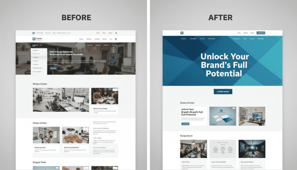
At Consort Creative, we specialize in building high‑performing WordPress websites that don’t just look great — they convert. Here are the five most common design mistakes costing established businesses valuable opportunities.
You Confuse Design with Strategy
A visually stunning site means nothing if it doesn’t connect to business goals. Design should support the strategy — guiding users toward key actions, not away from them.
Fix: Start every redesign with brand strategy and user journey mapping before touching visuals.
A landscaping company that invests in a beautiful website before defining who it’s targeting, what makes it different, and what action the site should drive will end up rebuilding that site within two years. The visual execution may be flawless — the strategic foundation will still be missing. Every redesign we do at Consort Creative starts with a strategy session before a single design element is touched.
Your Homepage Lacks Focus
If everything is important, nothing is. Overloaded layouts, multiple CTAs, and vague hero text leave visitors unsure what to do.
Fix: Identify one core goal — call, book, or download — and make it crystal‑clear above the fold.
For most small businesses, the homepage has one real job: make a credible first impression and point the right visitor toward the next step. That next step is usually a phone call, a form submission, or a service page. Every element of the homepage — the hero headline, the supporting copy, the imagery, the CTA — should exist in service of that single conversion goal. If your homepage is trying to explain everything your business does to everyone who might visit, it’s doing nothing well.
Your CTAs Don’t Stand Out
Muted buttons, generic phrases (“Learn More”), or too many options can stall conversions.
Fix: Use contrasting, accessible color palettes. Replace weak text with action‑oriented copy: “Book a Consultation,” “Start Your Project.”
Test your own site: pull it up on your phone and look at it for five seconds. Can you immediately see what you’re supposed to do next? If it takes more than a glance to find a phone number or a booking button, your CTA isn’t working. Specific language outperforms generic language consistently — ‘Book a Free 30-Minute Discovery Call’ converts better than ‘Contact Us’ because it tells the visitor exactly what happens next and how long it takes.
You’re Too Wordy (or Too Thin)
Long paragraphs without structure lose attention. Too little text kills SEO and clarity.
Fix: Balance visual hierarchy — short paragraphs, bold headers, clear spacing. Every line should clarify who you are and why it matters.
Short, structured copy is harder to write than long, rambling copy — but it converts dramatically better. Visitors scan before they read. If your key messages aren’t surfaced in your headlines, subheadings, and opening sentences, most visitors will never reach them. Aim for paragraphs of 2–3 sentences on conversion pages. Lead with the benefit, follow with the proof, end with the next step.
You Ignore Performance
Slow load times and poor mobile optimization destroy both rankings and trust.
Fix: Compress images, implement caching, and build on lightweight WordPress themes.
At Consort Creative, our development process blends brand storytelling with technical optimization — so your site performs as beautifully as it looks.
Site speed is also increasingly a GEO (Generative Engine Optimization) signal. AI search engines that browse live web pages to generate answers are more likely to successfully crawl and cite fast, clean pages than slow, heavy ones. On WordPress, the combination of a lightweight theme framework, compressed images, and a caching plugin like WP Rocket typically moves a PageSpeed score from the 40s into the 80s without a full rebuild. Run your homepage through Google PageSpeed Insights today — the results will tell you exactly where the load time is going.
What are the most common website design mistakes small businesses make?
The five most common are: (1) designing before setting a clear strategy and conversion goal, (2) homepage overload — too many messages and competing CTAs — (3) weak calls to action that use generic language like “Learn More” or “Contact Us,” (4) copy that’s either too long and unfocused or too thin to build credibility, and (5) ignoring page speed and mobile optimization. Most of these are fixable without a full redesign — a targeted audit can identify which ones are costing you the most conversions.
How do I know if my website is hurting my conversions?
The clearest signals: a high bounce rate on key pages (visitors landing and immediately leaving), low form submission rates relative to traffic, and prospects who visit your site but don’t follow up. Google Analytics can show you where visitors drop off. Google Search Console shows which pages are getting traffic but not clicks. A more direct approach: ask your last 10 clients how they evaluated your website before reaching out — their answers will tell you more than any analytics tool.
Can I fix website conversion problems without a full redesign?
Yes, frequently. The most impactful conversion fixes — rewriting a homepage headline, clarifying a CTA, restructuring a service page around outcomes rather than features, improving mobile load time — don’t require touching the visual design. A targeted content and UX audit typically identifies 3–5 high-leverage changes that deliver the majority of the conversion improvement. A full redesign makes sense when the underlying strategy is sound but the design execution has structural issues that content edits can’t fix.
What should a small business website CTA say?
The most effective CTAs are specific about what happens next and how much time it takes. “Book a Free 30-Minute Discovery Call” outperforms “Contact Us.” “Get a Free Brand Audit” outperforms “Learn More.” “Start Your Project” outperforms “Let’s Talk.” The pattern: action verb + specific offer + low commitment framing. Each primary page should have one dominant CTA — multiple competing options reduce conversion rates by creating decision paralysis.
How does website performance affect small business conversions?
Directly and significantly. Google’s research shows that as page load time increases from 1 to 3 seconds, the probability of a mobile visitor bouncing increases by 32%. At 5 seconds, that bounce probability increases by 90%. For small businesses where a single lost lead might represent hundreds or thousands of dollars in revenue, a slow site is a direct revenue problem. PageSpeed Insights (free, at pagespeed.web.dev) gives you a specific score and a prioritized list of fixes — start there.
Conclusion
Website design mistakes hurting conversions? Your website shouldn’t just exist — it should convert.
If your site isn’t bringing in quality leads, it might be suffering from one (or all) of these mistakes.
Let’s fix that. Request a Free Brand Audit with Consort Creative to turn your website into your best business tool.


- READY TO ACT ON THIS
Your Brand Should Be Working While You're Not.
If this article resonated, the next step is a free 30-minute conversation. No pitch, no pressure — just clarity about where your brand stands and what's worth fixing first.
Book a Free Discovery Call