
Consort Creative
December 20, 2025
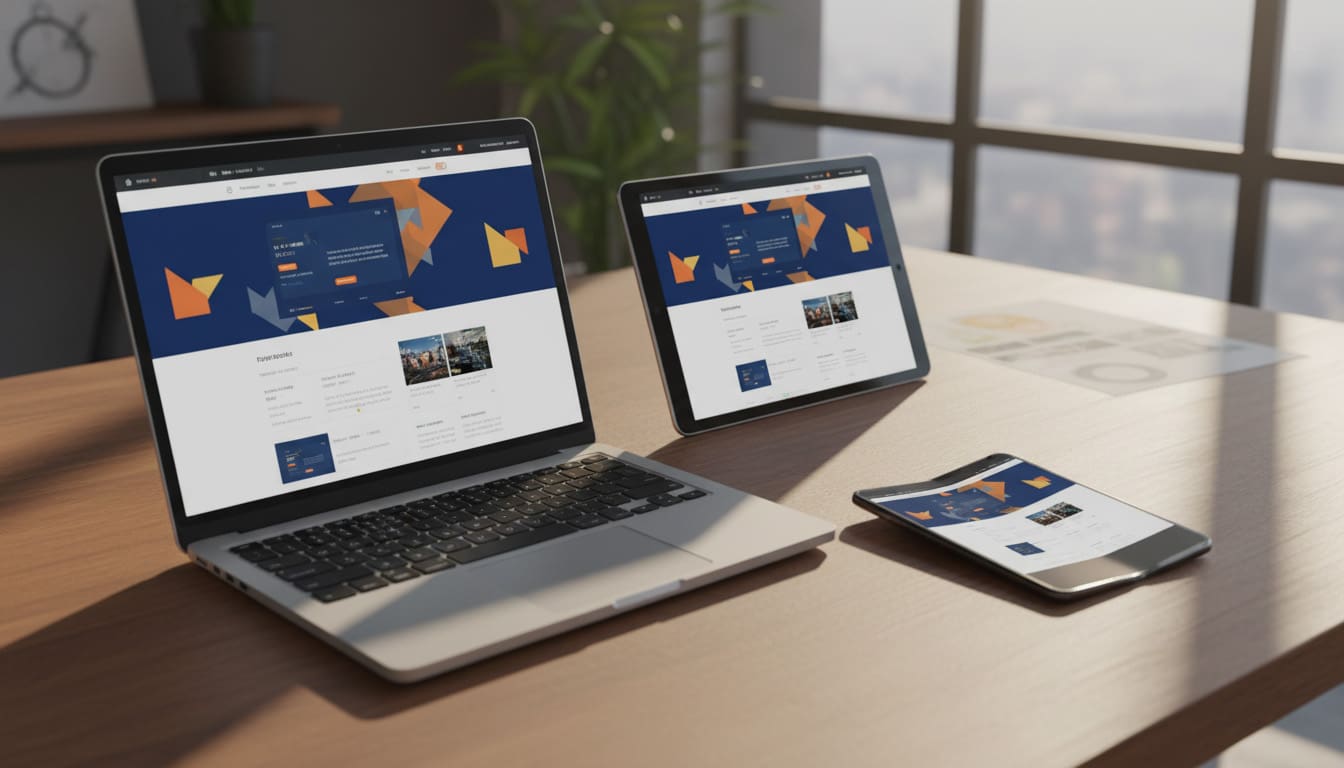
Responsive design is no longer just about resizing columns. By 2026, web experiences must adapt to AI interfaces, foldable screens, and wearable devices—fast.
At Consort Creative, we design with that future in mind. Here’s how you can future-proof your brand’s user experience with the latest responsive strategies.
1. AI-Adaptive Layouts Replace Static Breakpoints

Traditional breakpoints (mobile, tablet, and desktop) were enough five years ago. Now, AI helps designs adjust beyond device width—responding to context like user intent and lighting.
- Example: A WordPress page can use machine learning to reorganize content if the user is on a foldable device versus a traditional desktop.
- Quick Tip: Use CSS Container Queries and AI-driven adaptive plugins to move from fixed sizes to fluid content areas.
2. Dynamic Grid Systems Scale Content Intelligently
Static 12-column grids are outdated. Modern frameworks like CSS Subgrid and Grid Level 2 let you scale containers within containers for smarter placement.
Imagine a blog layout on desktop that instantly re-flows into a magazine layout with optimized card spacing on mobile—without overlapping elements.
The Developer Move: Define grid areas with relative fractions (fr units) rather than pixels. The browser does the math, and your Core Web Vitals improve.
3. Motion Responsiveness Enhances User Feedback
Modern devices detect motion via accelerometers and gyroscopes. Leveraging that data lets web components respond subtly to orientation or shake. No gimmicks—just delight.
- Example: Call-to-action buttons on a tablet could shift slightly to remain visible when the screen rotates horizontally.
- Technical Note: Always use
prefers-reduced-motionto respect user settings and maintain high accessibility.
4. Micro-Interactions Adapt to Input Type

Touch, voice, gesture, and stylus devices each demand different UX patterns. By 2025, micro-interactions will change based on how the user is interacting:
- Stylus detected: Tooltip instructions appear for drawing or precision clicking.
- Voice enabled: The UI shifts to larger visual feedback zones to confirm commands.
UX Tip: Pair micro-interactions with your visual branding. Animations, button easing, and color bursts should feel like an extension of your brand identity.
5. Performance Is Still the Most Responsive Feature
A responsive design that loads slowly still fails. Speed is design. To stay ahead, implement:
- Lazy loading for all off-screen elements.
- Next-gen images (WebP, AVIF) for maximum compression.
- Edge network delivery via CDNs.
Google’s AI-indexing now favors “perceptual speed”: sites that feel instantaneous through smart skeleton screens and adaptive loading.
The Future of Fluid Experience
Responsive design in 2026 is no longer about screens—it’s about states. Each interaction is contextual, predictive, and personalized. When your design framework understands user intent, you deliver consistency without compromise.
Consort Creative specializes in creating brand systems and WordPress sites that look great today and adapt to the tech of tomorrow.
👉 Book a Responsive Experience Audit to future-proof your digital ecosystem.
Lost in the Planning Phase?
Get a custom roadmap for your business. Schedule a free consultation with our guides.
Schedule Your Free Consultation