
DISCOVER
DESIGN
GROW
Gear Up. Show Up. Anywhere.
Rent 'N Trek is a peer-to-peer outdoor gear rental app concept built for travelers who want the adventure without the overhead. Consort Creative developed the complete brand identity — from wordmark to photography direction — in one cohesive system.
CLIENT
category
SCOPE
Full Brand Identity
SERVICES
Discover · Design · Grow
A Brand That Earns Trust at 10,000 feet
The peer-to-peer gear rental space has a fundamental trust problem — you're asking strangers to lend expensive outdoor equipment to other strangers. Airbnb solved this for homes. Turo solved it for cars. Rent 'N Trek needed a brand identity that could solve it for kayaks, tents, and sleeping bags in the specific context of outdoor travel destinations.
The brief was clear: modern and tech-forward enough to feel like a platform, rugged and adventurous enough to feel at home on a trailhead, and premium enough to justify handling gear worth thousands of dollars. That's a specific needle to thread — and the identity had to nail it from the very first visual impression.
Outdoor adventure
peer-to-peer marektplace
app concept
travel tech
startup brand
Client
Rent 'N Trek
Peer-to-peer outdoor gear rental for travelers — Turo for hiking, camping, and kayaking equipment
Adventure travelers 25–45 visiting national parks, ski towns, lake regions, and coastal destinations
Deliverables
Logo System
Color Oalette
typography
icon System
motion principles
Photography direction
social templates
brand style guide
EPS Logo FIles
Modern tech-forward chassis. Rugged adventurous soul. Premium enough to trust.
OUR METHODOLOGY
Discover. Design. Grow
Every Consort Creative engagement follows a deliberate three-phase framework — anchoring strategy before design, and design before execution. Rent 'N Trek was built from the ground up through all three phases.
01
Market Research & Brand Positioning
We began with competitive landscape analysis — mapping BorroUp, GeerGarage, Yoodlize, and GearCommons to understand what failed and why. Previous players collapsed into two traps: "Amazon-style" companies with high overhead, and peer-to-peer models with insufficient demand. Rent 'N Trek's edge: laser focus on travelers and vacationers, not local neighbors. That one insight defined the brand personality that followed.
Design
02
Full Brand Identity System
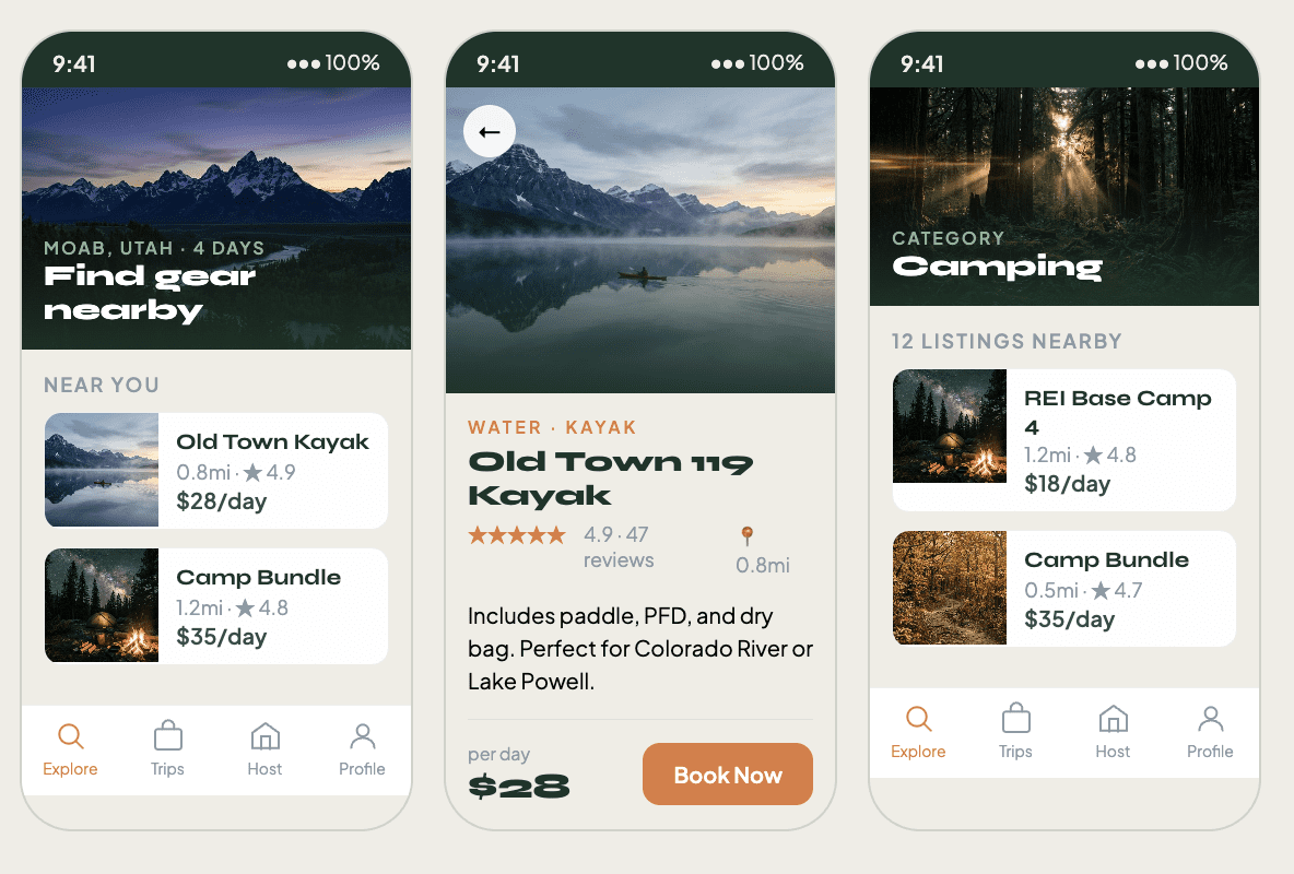
With positioning locked — "modern tech-forward with rugged adventurous soul" — we built the complete identity: the badge wordmark with its bold mountain mark, a green ramp palette from deep Pine to Summit orange, the Syne + Plus Jakarta Sans type pairing, 18-icon UI system, motion principles for developers, cinematic photography direction, and social media templates. Every element was pressure-tested against the same question: does this feel like Turo meets the trailhead?
grow
03
Assets, Style Guide & Growth Strategy
The final phase delivered everything needed to build from — EPS vector files for all logo variations, a compiled brand style guide, production-ready social templates, and a growth strategy including the supply-first launch sequence (Moab, Asheville, Lake Tahoe, Bend, Gatlinburg), Phase 2 demand channels, and a three-stream revenue model aligned to Turo's proven approach.
Logo System
The Wordmark —
Three Words. One Mark.
The Rent 'N Trek wordmark sets Syne 800 across all three words — "Rent," "'N," and "Trek" — at equal visual weight. The apostrophe stays lighter, reading as punctuation. The 'N anchors in Summit orange on dark backgrounds, shifts to Ember on light surfaces, and goes full white on Summit orange. The mark was refined once during the project: the original 'N felt visually weak. The solution was precise — bold the N, add a small space, keep the apostrophe light. That single change transformed the connection from awkward to confident.
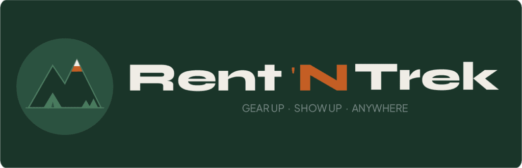
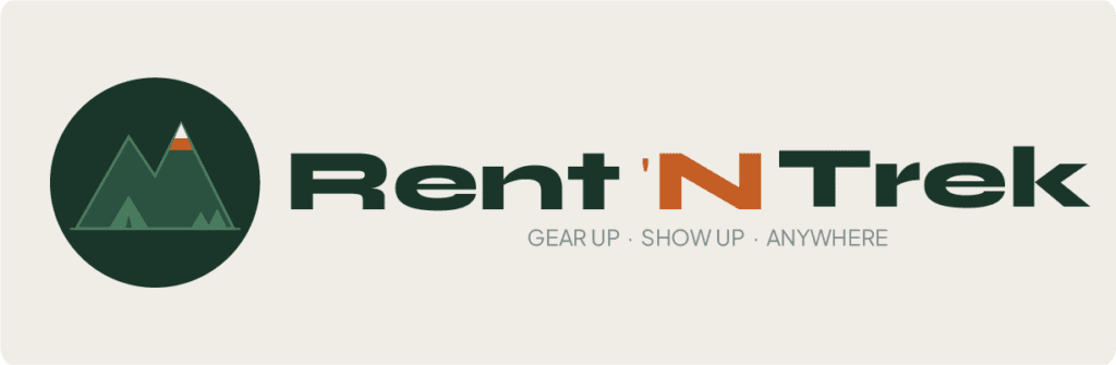
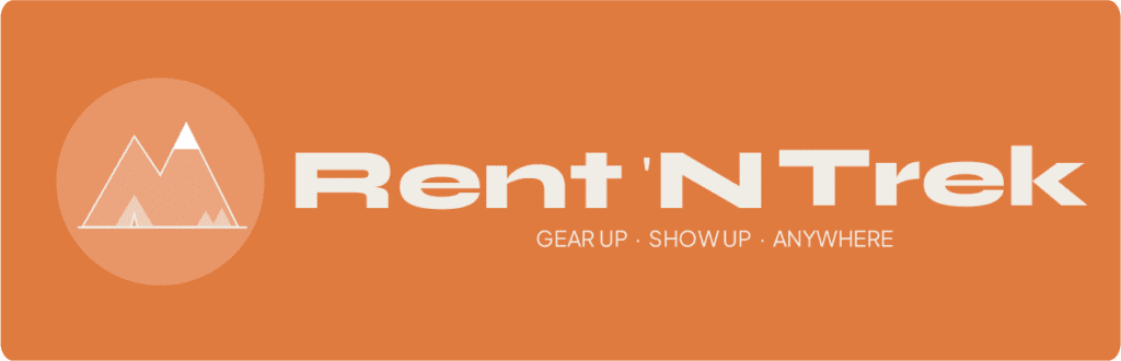
Rent 'N Trek
Syne 800 (ExtraBold) — all three words at equal weight | APOSTROPHE - Syne 400 — reads as punctuation, not a letter
300–600 weight range · Optimized for 375px mobile width · High legibility at 12px and below
Color System
The Green Ramp -
Pine to Mist.
Five greens from deep Pine to airy Mist form the brand's structural palette — evoking the density of a Pacific forest floor and the open sky above the treeline. Summit orange is the single action color, used exclusively for CTAs, highlights, and the 'N in the wordmark. Chalk replaces clinical white, giving every surface a warmer, more analog feel.
Pine
#1A3529
#2D5C42
#4A8060
Summit Orange
Ember
Elegant Script — Tiger Eye
Icon System
18 Icons. Three Families.
One Grid.
All 18 icons are drawn on a 24×24 grid with a consistent 1.5px rounded stroke — never filled. The water icon was refined during the project: the original paddle silhouette read as a sport action rather than a surface category. Two clean sinusoidal wave lines communicate water environment instantly, hold up at 16px, and sit comfortably in the category set without competing for attention.
MOTION PRINCIPLES
Four Rules. Zero Decoration
Motion in Rent 'N Trek is purposeful or invisible. Every animation communicates something — hierarchy, confirmation, progress, or feedback. Nothing moves to show off. Everything moves to help the user understand where they are and what just happened.
01
Purposeful Over Decorative
02
Enter Fast, Exit Faster
Elements arrive in 200–300ms. They leave in 100–150ms. Users want to see content, not wait for it. An element that lingers on exit feels broken. Exit speed is respect for the user's time.
03
Stagger Creates Hierarchy
When multiple elements appear together, they stagger at 60ms intervals. The first element announces the section. The rest follow in reading order. Never animate all elements simultaneously — it flattens the hierarchy you worked to establish.
04
Motion Stays Grounded
Elements slide up from below (Y: +16px to 0). Never drift, float, or scale in from nothing. Grounded motion respects the laws of physics enough to feel trustworthy — which matters when someone is about to hand their kayak to a stranger.
Photography Direction & SOcial Media TEmplates
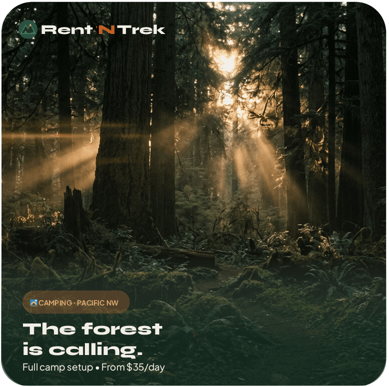
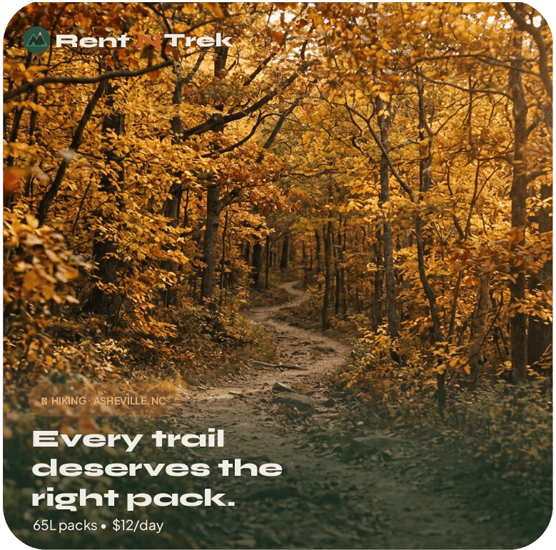
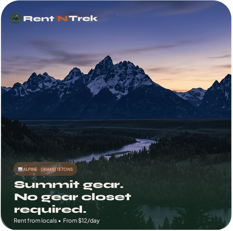
Cinematic. Grounded. Never Posed.
The photography system defines the visual world Rent 'N Trek inhabits — and every image that enters that world must pass one test: does it feel like it was shot by someone who was actually there? No staged adventure, no forced smiles, no midday flat light. Anamorphic lenses, film grain, blue hour and golden hour only.
01
01
01
01
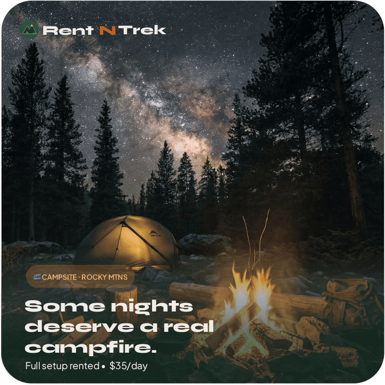
Every social template shares the same grid overlay, logo placement at top-left, and type hierarchy — so the feed looks intentional even as individual posts vary in color and scene. Four square formats cover gear features, host spotlights, CTA moments, and trail tips
THE FULL STORY
COLOR & VISUAL
IDENTITY RATIONALE
A green Ramp Pulled from The Forest Floor.
The Rent 'N Trek palette was built around a simple truth: the brand lives outdoors. Deep Pine — the darkest point in the green ramp — evokes the density of an old-growth forest at dusk, the color of the canopy when the trail disappears into shadow. From there the palette opens through Forest, Moss, Sage, and Mist, arriving at the near-white of Chalk rather than clinical white. That progression mirrors the actual experience of emerging from dense forest into open sky — and it gives the brand a range of environmental depth that no single color could achieve alone.
Summit orange was a deliberate restraint decision. Most outdoor brands scatter warm tones throughout. For Rent 'N Trek, orange fires in exactly one context: action. CTAs, the 'N connector, active icon states, and the highest-emphasis UI moments. That discipline means Summit orange retains its full energy every time it appears — it never becomes wallpaper. The wordmark refinement — bolding the 'N to match Rent and Trek, adding a small space, keeping the apostrophe lighter — was the most impactful single change in the project, transforming a connector that felt like punctuation into one that reads as a confident bridge between two strong words.
Built for the Platform Brand
and the Trail Moment.
The central tension in the Rent 'N Trek brand was serving two masters simultaneously: the platform trust that makes a user comfortable handing over a $1,200 kayak, and the adventure energy that makes a traveler excited to rent it in the first place. Platform brands (Airbnb, Turo) earn trust through professionalism, clean UI, and structured visual systems. Adventure brands earn excitement through raw photography, tactile texture, and bold typography. Rent 'N Trek needed to be both at once, in every touchpoint.
Syne solved the typography problem. Its architectural weight reads as tech-forward and premium — not granola. Plus Jakarta Sans handles all supporting text with the kind of geometric clarity that scales perfectly on the 375px mobile screens where most gear searches happen. The icon system's strict 1.5px rounded stroke rule keeps every UI element legible and consistent from 16px list icons up to 48px hero moments. The motion principles — four non-negotiable rules backed by eight named tokens — gave the development team a complete implementation guide without any ambiguity. Consort Creative is a branding agency for startups and tech-forward businesses who need an identity system that performs as well in production as it looks in the style guide.
THE RESULTS
A Complete Brand System Ready to Ready to Build From.
Rent 'N Trek launched from this engagement with every asset needed to go from brand identity to funded startup: EPS vector files for all seven logo variations (primary dark, reversed light, Summit orange, badge-only dark, badge-only light, wordmark-only dark, wordmark-only light), a compiled brand style guide, a production-ready social template library, and an AI image generation prompt library that ensures every piece of future photography — whether shot, sourced, or generated — fits the same cinematic visual world.
The identity system was designed to scale — from a five-screen MVP app to a fully funded platform operating across multiple outdoor destinations. The design tokens, motion principles, and icon grid were all built to hand directly to developers. The photography direction was built to hand directly to content creators. The social templates were built to hand directly to a marketing hire. Every deliverable was built so the brand could grow without needing to revisit the foundation.
- FREQUENTLY ASKED QUESTIONS
Common Questions About Our Work.
Everything you need to know about the Rent 'N Trek brand project — and what a startup brand identity engagement with Consort Creative looks like.
▸How much does brand identity design cost for a startup app?
▸What is included in a complete app brand identity package?
▸How do you build a brand for a peer-to-peer marketplace app?
▸Why is photography direction important in a brand identity?
▸How does Consort Creative approach logo refinement?
START YOUR JOURNEY
Ready to Discover
What Your Brand Can Be?
Every great brand starts with a conversation. Let's talk about where you are, where you want to go, and how we get there together.