
Mesa County Fair 2025 — Website Redesign Case Study
Overview
Goals
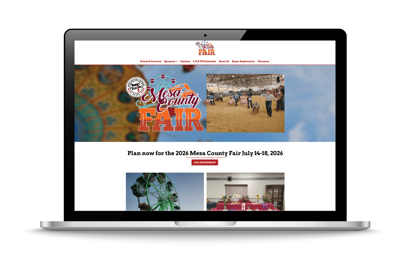
- Redesign the site to align with the 2025 branding and theme.
- Improve mobile responsiveness for visitors accessing schedules and vendor forms on the go.
- Simplify navigation and highlight key user actions like event viewing and vendor signup.
- Reflect the fair’s personality—fun, welcoming, and community‑focused.

Process
- Research & Discovery: Reviewed the existing site (mesacountyfair.org), analyzed audience needs, and mapped user journeys for families, vendors, and sponsors.
- Wireframing & Layout: Developed mid‑fidelity wireframes focusing on accessibility, clear hierarchy, and visual storytelling through imagery.
- Visual Design: Created a clean yet rustic aesthetic—using warm color palettes, playful typography, and organic textures to evoke a true fairground feel.
- Responsive Mockups: Designed tailored interfaces for desktop, tablet, and mobile displays to ensure consistency and readability across all screen sizes.
- Prototyping & Feedback: Built interactive mockups to demonstrate navigation flow and gathered feedback before finalizing layouts.
Key Features
- Interactive Event Schedule: Easy navigation through daily events and ticket info.
- Vendor Registration Portal: Streamlined sign‑up process for local businesses.
- Photo & Media Section: Showcases highlights from past fairs.
- Simplified Navigation: Quick links to tickets, events, sponsors, and fair history.
Design Style
Outcome
Your Next Transformation Starts Here
DISCOVER
DESIGN
GROW
Fitness Brand Redesign: Shape2Tone Identity & Website Transformation
Shape2Tone came to Consort Creative after 14 years in business with a brand that no longer matched their momentum. As one of Orange County's most established personal training studios — with locations in Orange and Huntington Beach — they needed a full fitness brand redesign: a new logo identity, a dark-forward website, and a digital presence built to convert. This case study documents the complete transformation from a dated teal identity to the Ember & Stone brand system.
Personal Fitness / Wellness
LOCATION
Orange County, CA
SCOPE
Brand Identity + 9-Page Website
SERVICES
Discover · Design · Grow
OUR METHODOLOGY
A Proven Studio. An Invisible Brand
Shape2Tone had been serving Orange County for over 14 years, earning top trainer recognition year after year. But their brand wasn't telling that story. The existing website felt dated, the logo lacked personality, and the visual language didn't reflect the quality or warmth of the experience Kevin and his team actually deliver.
For a target audience of driven, health-conscious adults between 30 and 50, the brand needed to feel as premium, intentional, and results-focused as the training itself — and it simply didn't. Kevin came to Consort Creative with a clear goal: more qualified leads and a brand his clients could feel proud to recommend.
Client
Shape2Tone — Kevin Weston
Locations
Orange, CA · Huntington Beach, CA
Deliverables
Brand Identity
Logo System
Color Palette
typography
9-Page Website
Ai SEO
Target Audience
Adults 30–50 seeking premium personal training
Client
Qualified lead generation & brand differentiation
The Challenge
Discover. Design. Grow
Every Consort Creative engagement follows a disciplined three-phase framework — ensuring each decision connects brand strategy to real business outcomes.
Target Audience
01
Uncovering What the Brand Needed to Say
We began with an in-depth discovery session with Kevin to map his 14-year track record, understand his ideal client, and identify the gap between how Shape2Tone was perceived and how it deserved to be seen. We audited the existing site, analyzed the Orange County fitness competitive landscape, and defined the positioning clearly: premium, personal, and built for the long haul.
Design
02
Building an Identity System That Earns Attention
From discovery, we developed the "Ember & Stone" brand identity — naming the direction before building it, which helped Kevin immediately connect with the vision. The logo, palette, and typography system were built as a cohesive whole, then extended into a nine-page website designed to convert the right visitors into booked consultations. Every page was structured around a single question: what does a 35-year-old professional need to see before they schedule a free trial?
grow
03
Positioning for Search, AI, and Long-Term Leads
We began with an in-depth discovery session with Kevin to map his 14-year track record, understand his ideal client, and identify the gap between how Shape2Tone was perceived and how it deserved to be seen. We audited the existing site, analyzed the Orange County fitness competitive landscape, and defined the positioning clearly: premium, personal, and built for the long haul.
BRAND TRANSFORMATION
Before & After —
The Visual Identity.
BEFORE — ORIGINAL BRAND
LOGO

COLOR PALETTE
#3ABBC8
#2B2B2B
#9B9B9B
#FFFFFF
PRIMARY DISPLAY FONT
BODY FONT
LOGO
COLOR PALETTE
Obsidian
Ember
Flame
Warm White
Stone
PRIMARY DISPLAY FONT
BODY FONT
Outfit — Clean, modern, highly readable
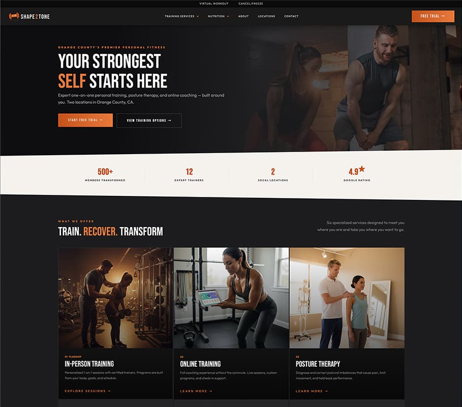
BEFORE — 2025 Website
THE FULL STORY
COLOR & VISUAL
IDENTITY RATIONALE
Colors Chosen to Resonate With Real People, Not Gym Clichés.
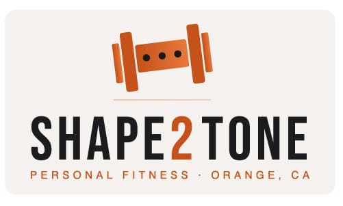
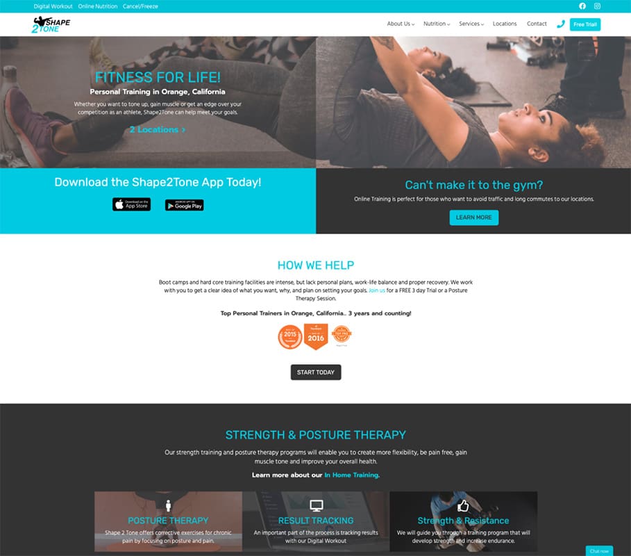
The previous brand leaned heavily on teal and cyan — colors common in the fitness industry but generic in execution, doing little to differentiate Shape2Tone in a crowded Orange County market. For the rebrand, we developed the "Ember & Stone" identity system built around a palette of Obsidian, Ember, Flame, Warm White, and Stone. This direction was deliberate. The ember gradient — a rich progression from warm amber through deep burnt orange to dark mahogany — communicates heat, energy, and transformation without resorting to the aggressive neon palette common in mass-market fitness brands. It speaks to the internal drive of someone who trains because they care about longevity, not just aesthetics.
The deep Obsidian grounds the palette with sophistication and authority, signaling that this is a studio run by serious professionals. Warm White and Stone provide breathing room and approachability, which matters when your audience includes clients managing chronic pain or navigating fitness for the first time in years. Together, the palette positions Shape2Tone exactly where Kevin wanted it — premium, personal, and built for the long haul.
Designed to Convert the Right Clients — From First Impression On.
The project began with a brand discovery session focused on understanding Kevin's clientele, his 14-year track record, and the gap between how Shape2Tone was perceived and how it deserved to be seen. From there, we developed the Ember & Stone identity system — naming the brand direction before building it, which helped Kevin and his team immediately connect with the vision. The logo was rebuilt from the ground up using Bebas Neue for the wordmark, a bold display typeface with the strength and structure the brand needed, while the "2" was treated in the ember gradient accent to create a distinctive, ownable detail.
The website was then designed and built on WordPress using Themeco Pro and Cornerstone, giving Kevin a flexible, fast platform his team can manage going forward. The nine-page site — covering Home, About, In-Person Training, Online Training, Posture Therapy, Nutrition, Corporate Wellness, Locations, and a Free Trial landing page — was architected with lead generation as the primary objective. Every page was structured to move a prospective client toward either the Free Trial CTA or a direct conversation with Kevin's team. Alongside the design and build, the site was optimized for both traditional SEO and generative engine visibility, ensuring Shape2Tone surfaces not just in Google searches but in AI-assisted responses when someone in Orange County asks for the best personal trainers near them.
THE RESULTS
A Brand Ready to Grow — Built for the Next 14 Years.
The new brand gave Shape2Tone something the previous identity couldn't — a visual presence that matches the reputation Kevin has spent 14 years building. The Ember & Stone system unified every touchpoint, from the website to future marketing materials, under a single coherent identity that speaks directly to the 30-50 year old professional who wants expert guidance, not a gym membership. The redesigned website replaced a fragmented, outdated layout with a focused, conversion-driven experience built around a clear value proposition and a low-friction Free Trial offer.
With the brand, site architecture, and AI SEO strategy aligned for the first time, Shape2Tone is fully positioned to attract the qualified leads Kevin has been after — clients who are ready to commit, not just browse. Performance metrics will be published here as they develop post-launch.
WHY IT MATTERS
“For the first time, the brand feels like the business we’ve actually built.”
Shape2Tone now enters every client conversation backed by a visual identity that communicates 14 years of expertise from the very first impression. The site is live, the brand is unified, and the foundation for sustained growth is in place.
Frequently Asked Questions
Answers to the questions small business owners ask us most. Don't see yours? Start a conversation — we read every message personally.
▸What does a fitness brand redesign cost?
▸How long does a fitness website redesign take?
▸What are the best fonts for fitness brands?
START YOUR JOURNEY
Ready to Discover
What Your Brand Can Be?
Every great brand starts with a conversation. Let's talk about where you are, where you want to go, and how we get there together.